- Telegram : t.me/pinc360
- Telegram : t.me/pinc360
The design face-off: graphic designer vs client
When it comes to graphics and imagery needs, designers and clients know that their collaboration is essential in order to establish a polished brand look that’s reflective of the client’s business. But truth be told, the journey towards achieving great design and a happy client is not all rainbows and roses. Sometimes, the creative interpretation of these two personas differs, pushing their relationship (or the lack thereof) to the side.
Let’s take, for example, this case: when the client excitedly explains what he or she wants in the logo—from the colour to the gloss and the type of font as well, he or she expects the designer to capture everything. But when the designer turns over the completed work, highlighting the requested cursive text, the client gets frustrated and demands for the cursive text to be included, only to find out that the client meant the Curly Sue font we all used to play with when typing in MS Word when we were little boys and girls.
True enough, clients and designers don’t always see things eye to eye, enough for them to bicker around that the only missing thing you need to do is put them inside the boxing ring and you get the picture.
While this reality might be sad, it is actually amusing if you come to think of it. If you are ready for a laugh, let’s run down the common causes of disagreements between designers and clients.
Huge props to design resource company Pixelo for sharing their “Graphic Designer Vs Client” video, which had all designers and clients laughing.
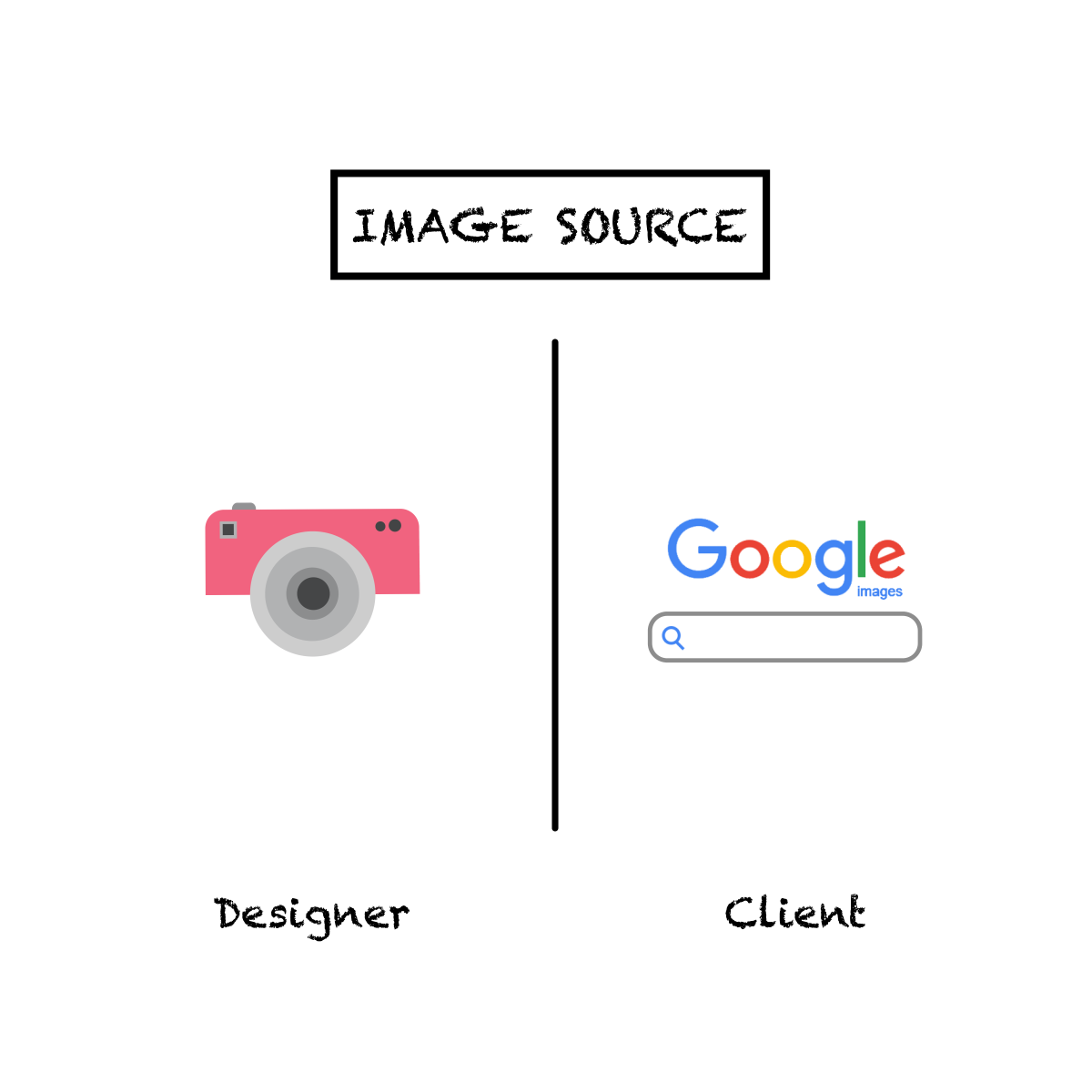
- If this image speaks, this is what you’ll hear, “Why is your design fee expensive? You can use the image URL I attached for the website.” They just don’t understand. No.
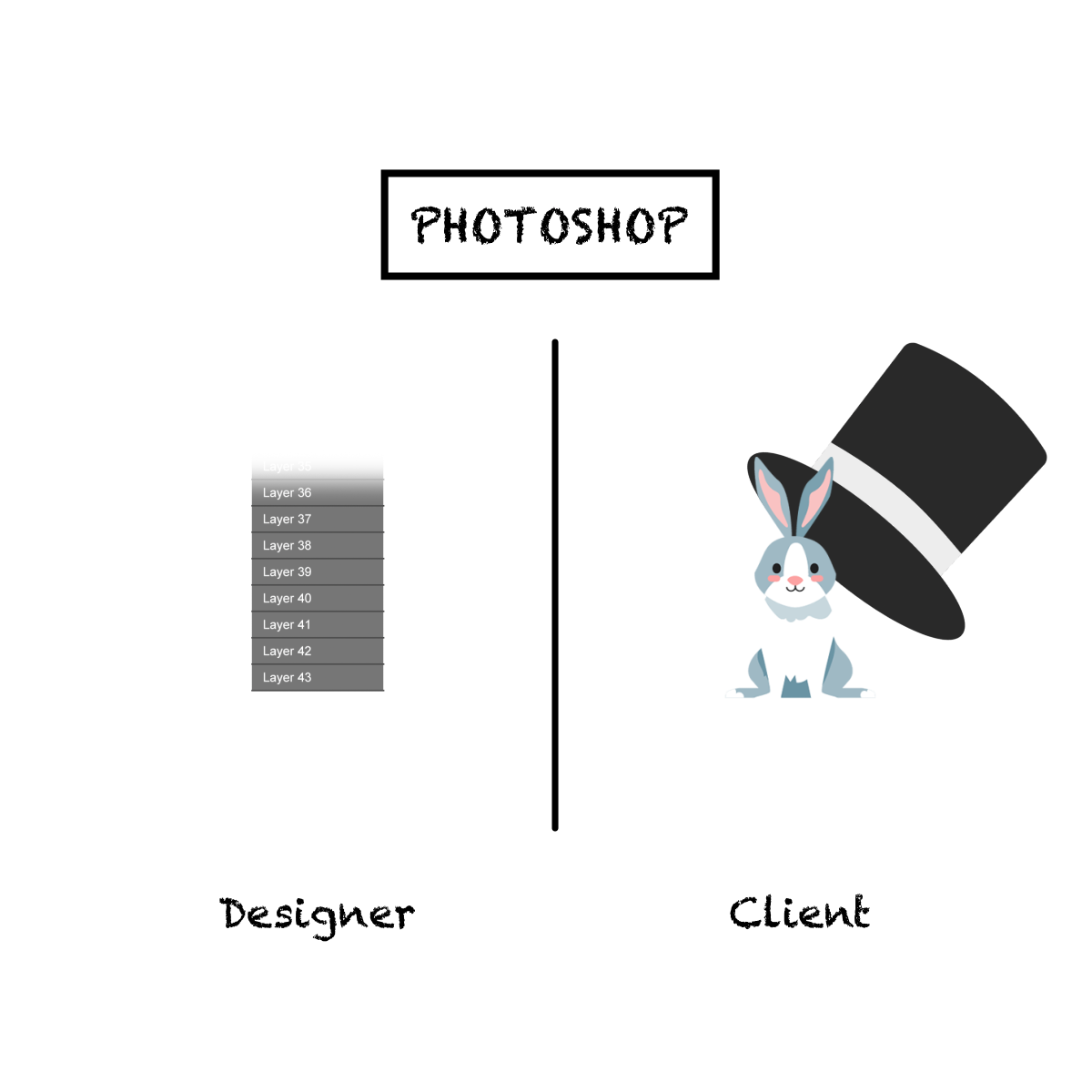
- “You know what, I can do the design myself. It’s so simple to hide the irregularity by covering it up a white square. Ooooh, wait. How do you make the background transparent again?”
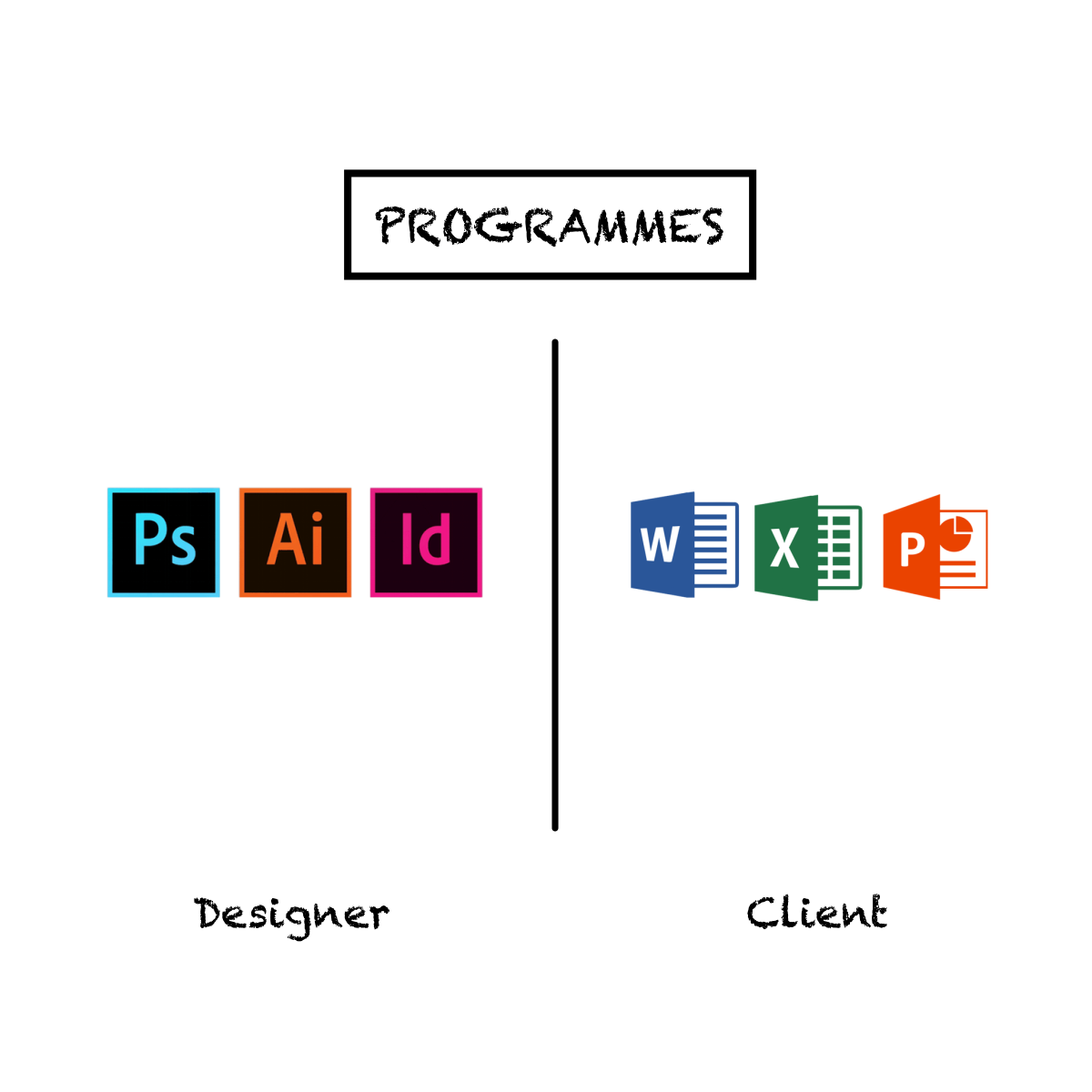
- “Oh, you use Photoshop? Same.” OMG!
- “What’s taking you so long? I sent the brief last night. You should be done by now!” says the client who wanted an iconic logo in the likes of Coca Cola, LG, and Nike for his brand called Mr. Dolittle, an exotic ice cream parlor (of course, this is made up!).
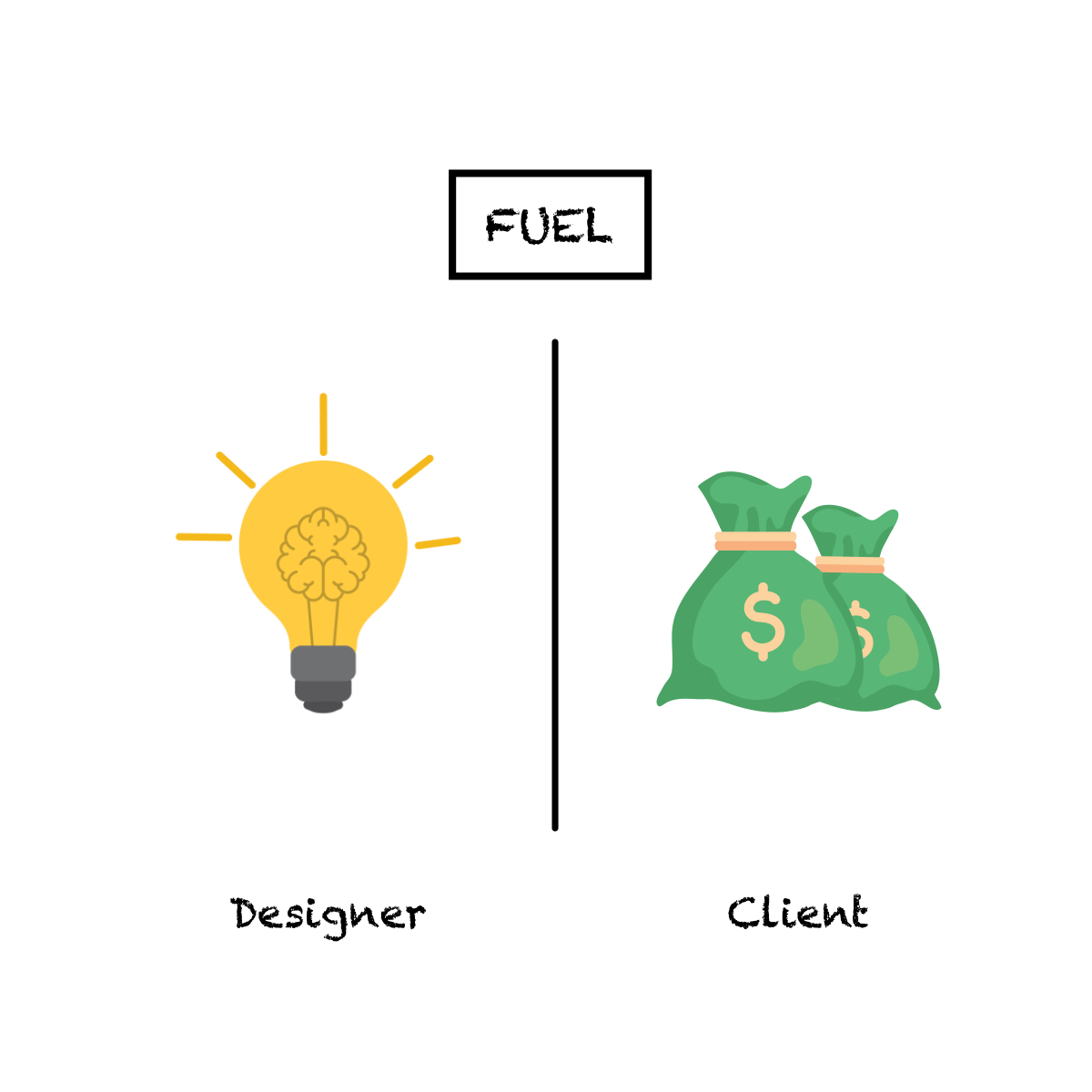
- “But you said you wanted this exact design 3 hours ago, client. Now, what’s left is this tiny line?”
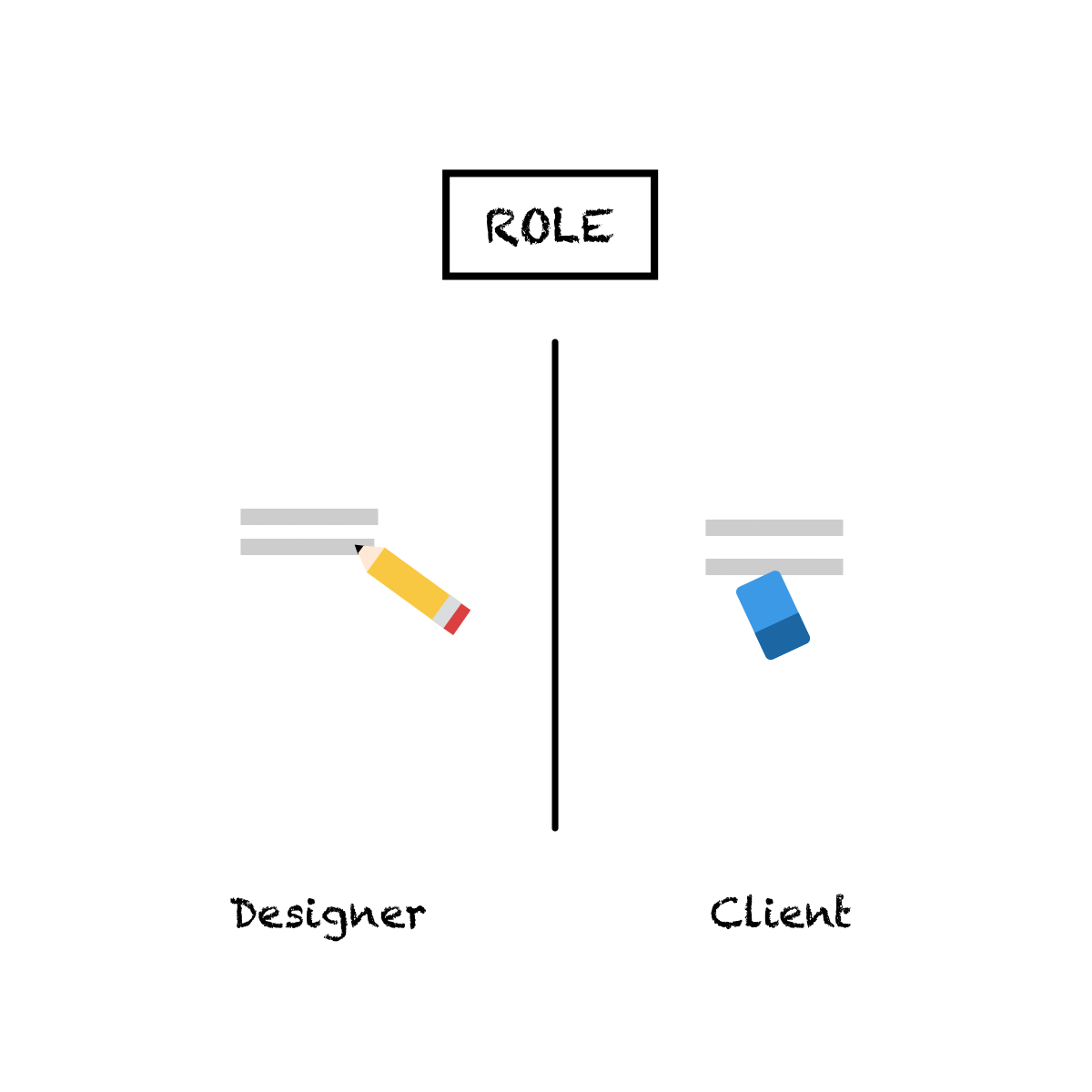
- “Let’s chase time! We need to launch this ASAP so my business can run!”
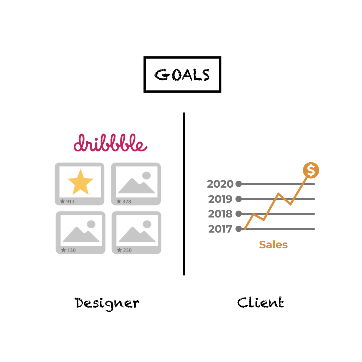
Funny, right? From the software used to the creative process, clients and professionals can’t just seem to agree, especially on this next batch.
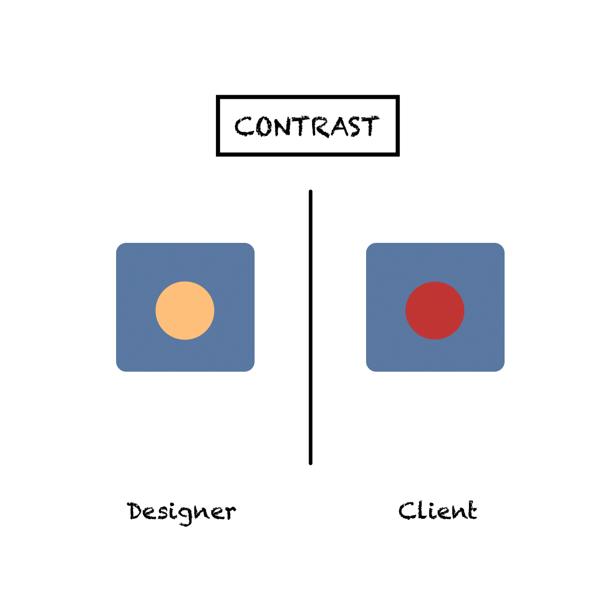
- “It’s not just bright enough.”
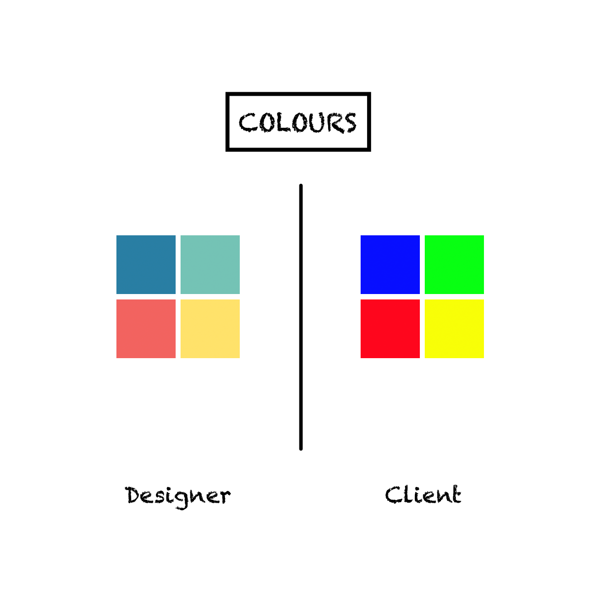
- “I wanted a fun font! What you designed is boring.”
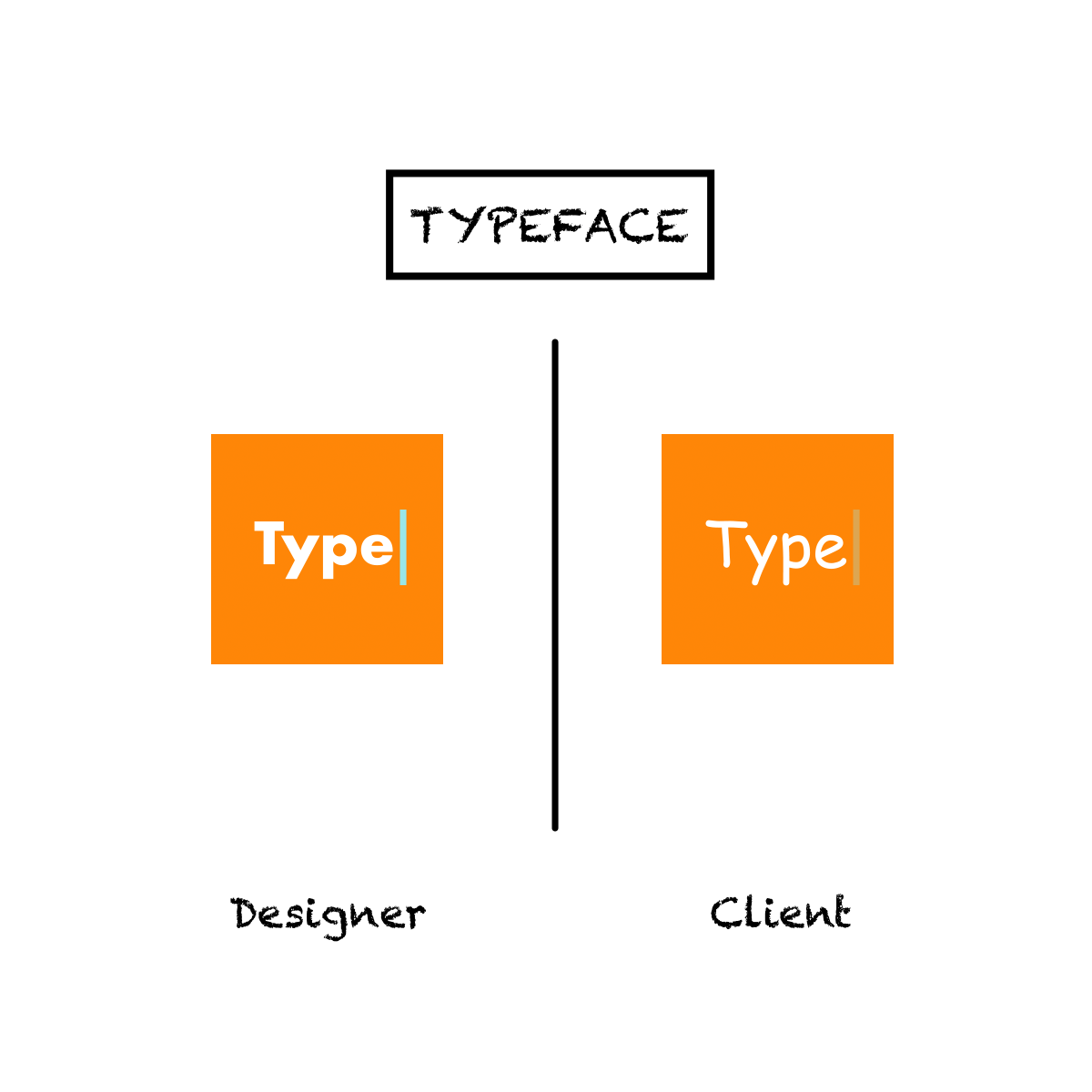
- “This is how you make it pop and stand out.”
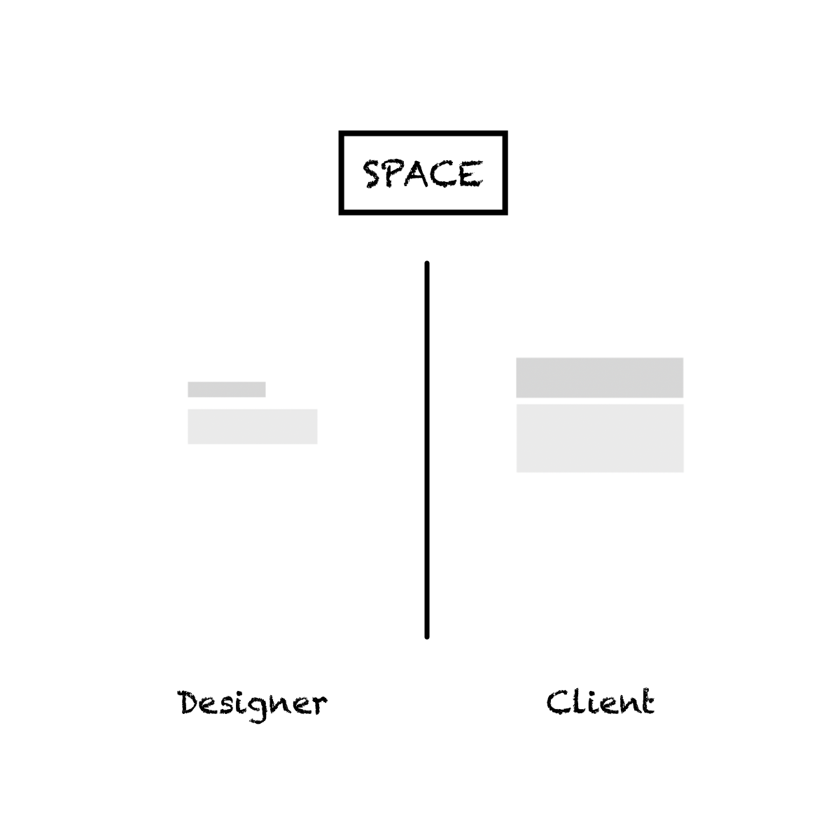
- “Don’t you think the space is not wide enough?”
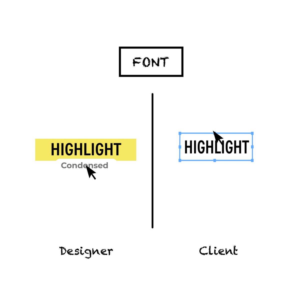
- “Why don’t you get me?”
Did this list give you a laugh? Because it sure did make our day. If you found this hilarious, don’t forget to share it with your designer friends!
Related Posts
Three amazing social media campaign ideas and why they worked
As a marketer, social media campaigns are one of a few great ways to promote your brand or market your product or services. It’s for the best that you keep your social media content postings…
- May 16
Noteworthy Valentine’s Day Campaigns for 2021
A day where guys burn their savings like a bullet train and girls sharing about their unique Valentine date experiences on social media, Valentine’s Day is celebrated both on a personal and a corporate level….
Basket
Product categories
- Agency (10)
- Platform (25)
- Digital and Social Media (11)
- Lead Generation (3)
- Public Relations (1)
- Technology Development (10)
Categories
Latest Posts
WordPress vs. Wix: Which is better for professionals?
- October 6, 2023
7 signs of a top-quality Instagram marketing strategy
- October 6, 2023
5 benefits of LinkedIn for business growth
- October 6, 2023
What is PR? A quick guide to public relations
- October 6, 2023
Top 12 WordPress plugins you need for your business website
- October 6, 2023


